
By Owen Kewell and Adam Sigesmund (@Ziggy_14)
Player comparison is a popular topic of debate among armchair general managers: which guy is better? Would you rather have Player A or Player B? In the wake of a big 1:1 trade, which team won? While in the past we were left to bias, favouritism, and the infamous eye test, today we have some visualization tools to help compare players across useful metrics.
HERO Chart:
One of the best and most intuitive of these tools is the HERO Chart, as pioneered by Domenic Galamini Jr. (@MimicoHero). These charts, which are within the realm of descriptive statistics, can be found at the following website: http://ownthepuck.blogspot.ca/
Below we can see Alex Ovechkin’s HERO Chart:

What Stats Are Measured?
HERO charts show performance across five stats: ICETIME, GOALS, FIRSTA, SHOTGEN, and SHOTSUP. ICETIME refers to all-situation (even strength, power-play, or short-handed) minutes per game. GOALS measures 5-on-5 goals per 60 minutes, while FIRSTA measures 5-on-5 first assists per 60 minutes. SHOTGEN is 5-on-5 shots generated per 60 minutes and SHOTSUP is 5-on-5 shots suppressed per 60 minutes, both relative to average. These stats are measured across the most recent three seasons, with weightings of 44%-33%-22% respectively to ultimately reach a single measure.
It’s important to note some key features of these metrics. Aside from ICETIME, the other four stats are measured only at even-strength and per 60 minutes of playing time. This serves to level the playing field, and accounts for the situation and frequency with which different players are deployed. Making these adjustments gives us a better sense of a player’s true performance, though we must consider HERO chart results in an appropriate context. Logging massive minutes and special teams scoring remain hugely important parts of the game, so they should not be disregarded when evaluating a player’s usefulness even if they are not reflected in a player’s HERO chart.
What Do the Numbers Mean?
Each of the numbers you see represents a standardized rating from 0 to 10. A rating of 5 represents league average performance at a skater’s position, with a standard deviation of 2 in either direction. For example, as we can see, Alex Ovechkin is league average at first assists compared to eligible wingers. A rating above 5 shows performance above league average, and vice versa. The scores are normally distributed with a standard deviation of 2. We can see that Ovechkin is considerably above league average at generating shots, and somewhat below league average at suppressing shots.
Can I See Someone’s Stats Over Time?
Yes you can! Just under the HERO chart you’ll find a chart showing how the player has performed over recent years. The dark blue line represents primary points per hour, and the light blue line represents shot impact per hour. Here is Ovechkin’s. We can see a slow decline, though Ovechkin remains a strong performer in both metrics.

How Do I Compare Players Directly?
HERO charts were largely built to perform direct comparison, so when you enter Domenic’s website you’ll see two charts beside each other. You can select players of your choice from the dropdown menu for either chart and see a direct comparison. Let’s compare two elite centres: Sidney Crosby and Connor McDavid.
Scanning the charts, we can see that Crosby ranks higher in goals and shot generation, while McDavid ranks higher in first assists and shot suppression. Both players are fantastic across the board.

What Else Can I Do?
In addition to comparing players to other players, we can compare players to positional archetypes. For example, we could see how Max Pacioretty stacks up compared to the average first-line winger, or how Morgan Rielly performs relative to an average #1 defenceman. Below we can see Pacioretty’s chart:

If you’re interested in learning more about how the archetypes are calculated, there’s a section labelled ‘Chart Guide’ on the website containing an explanation of the methodology. Personally, I (Owen) enjoy using archetype comparisons to evaluate acquisitions that my favourite team makes, as it gives a high-level indication of where a player could fit into a lineup. It’s also useful for convincing your friends that the young guy you’re bullish on has legitimate upside, and that your team is going to go all the way because of it.
I Have Unanswered Questions - Where Do I Go?
That’s a quick and dirty explanation of what HERO charts are and how to use them. If you have any burning questions that are unaddressed, I encourage you to read through the HERO chart FAQ’s that Domenic published. The link can be found here: https://ownthepuck.wordpress.com/2017/01/21/hero-charts-frequently-asked-questions/.
All-3-Zone Player Comparison Tools:
Eric Tulsky once said "the magic of analytics is in recording all of the small things lost to memory that add up to something significant.” The easiest events to remember after you watch a hockey game are the big events: the goals, and sometimes even the shots. What you probably don’t remember, though, are the small plays that led up to those events, and the small plays that led to nothing at all. Tulsky worked with people like Corey Sznajder (@Shutdownline) to study the events in the neutral zone that drive offense. Although Tulsky now works for the Hurricanes, Sznajder runs a massive tracking project whose numbers are brought to life by CJ Turtoro's (@CJTDevil) All-3-Zones Player Comparison Tools. Before we learn about these tools, it is important to note that Sznajder literally watches every game to collect these stats, as opposed to the data from HERO charts which are released by the league and then displayed as you saw earlier. The sample sizes in these visuals are smaller as a result, but we will see in a moment how they capture some important ways that players create value for their teams.
There are two sets of visuals, which can be found at the links below:
First, we will discuss the set of visuals you can find by clicking that first link above. Below, you will see a screenshot of one of the four visuals available at that link:

The stats displayed on this page quantify what happens when a player tries to enter the offensive zone with the puck. He can either carry it in (carry-ins/60), dump it into the zone and then chase after it (dump-ins/60), pass it off to a teammate (Entry passes/60) or fail in his attempt (fails/60).
We care about these numbers because entering the offensive zone with control of the puck is a reliable way to create offense. It is one way to quantify a small thing lost to memory that gives rise to something significant. As you can probably see from the leaderboard above, players who succeed at entering with control are better at creating offence than those who struggle to bypass opposing defenders. This is why the players here are sorted by possession entries (carry-ins + entry passes per 60 minutes).
While tracking carry-ins is a way to quantify the creation of offence, we can also use these numbers to quantify defence. Whenever a player tries to carry the puck into the offensive zone, the opposing defenders want to stop them. The best defenders in these metrics allow the fewest possession entries. The worst ones allow attackers to create offence with ease. It should not surprise you, then, that attackers try to target the defenders who struggle to defend the blue line. Defenders who allow possession entries 90% of the time they are targeted by opposing teams are obviously quite poor at defending the blue line. Below, you will see which defenders allow the fewest possession entries as a percentage of the number of times they were targeted:

Some of the best defenders in the league show up in this leaderboard, which is further validation that what we are studying is actually important. It is always a good sign when the numbers are validated by the eye test and by years of research.
The best defensive teams either prevent zone entries altogether, or they remove the puck from the defensive zone as soon as possible. Indeed, zone exits are another way to measure defensive contributions in hockey, for both forwards and defensemen. The screenshot below shows which players succeed at removing the puck from their zone:

Again, positive contributions are measured by Possession Exits/60. Exiting with possession of the puck occurs when a player carries the puck out of the defensive zone (carries/60), or when they make a successful pass to a teammate (Exit passes/60). If a player fails to exit the zone with the puck, it is obviously a failed attempted (Fails/60). If he dumps it, clears it, or ices the puck, he is merely giving the other team another chance to create offence, which is why Possession Exits/60 ignores Dumps/60, Clears/60, and Icings/60. Exiting the defending zone with possession of the puck is obviously better than not.
So far, we have learned how to quantify the ways players transition from the defensive zone to the neutral zone, and then into the offensive zone. All of these numbers have one underlying theme: Puck possession leads to shots. But how do we measure which players create the most shots? While the obvious answer is to count the number of shots a player takes, the tracking project takes this one step further, and counts up to three passes before each shot is taken. In the same way that points are counted as goals and assists at the player level, the tracking project keeps track of shots and the passes that precede them. The visual below illustrates how each player contributes to shots by shooting or passing:
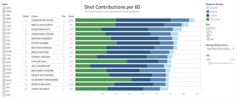
This leaderboard ranks players by their Total Shot Contributions per 60 minutes. A player contributes to a shot if he is the shooter (Shots/60), or if he made at least one of three passes before the shot was taken. Assisting on a shot is the same as assisting on a goal, except Shot Contributions consider up to three passes before a shot while points only consider two passes. If a player made a pass immediately before the shot was taken it is called a Primary Shot Assist (sA1/60), if he made the second pass before the shot it is a Secondary Shot Assist (sA2/60), and if he made the third pass it is a Tertiary Shot Assist (sA3/60). Altogether, shot contributions are an excellent and reliable way to measure which players are creating offence.
Now that we have explored this first set of 4 visualizations, we can move on to the second part: The Player Comparison Tool. As you will see below, the Player Comparison Tool presents the numbers in a way that summarizes all of the stats we have learned about from the leaderboards. Take a look:

Most of the stats seen here should seem familiar, but this time they are aggregated to provide you with a more general snapshot of each player. For example, the Shot Contributions leaderboard we saw earlier broke down Shot Contributions into four stats: shots, primary shot assists, secondary shot assists, and tertiary shot assists. The Player Comparison Tool, summarizes these numbers to measure shooting (Shots60), passing (ShotAssists60; sA1/60 + sA2/60 + sA3/60), and total contributions (ShotContr60; Shots60 + ShotAssists60).
The zone entry leaderboard is summarized in the Entry section, using possession entries expressed as a rate stat (PossEntries60) and possession entries expressed as a percentage of total entry attempts (PossEntry%). Similarly, the zone exit leaderboard is summarized in the Exit section.
It is important to note that if you are viewing a forward using this tool, you will only see the first three sections. The fourth section, Entry Defence, is only available for defenders. This section summarizes the aforementioned Entry Defence per Target leaderboard. As discussed earlier, the best way to defend the blueline is to prevent attackers from entering the zone with control of the puck. A defender who breaks up a play at the blue line is credited with breaking up the play (Breakups60). Defenders who concede controlled zone entries less often are the ones who rank best in the second stat (PossEntriesAllowed60). This is also expressed as a percentage of the number of times the defender is the target of an attempted zone entry by the other team (PossEntry% Allowed).
You can view a players results in two 1-year windows and one 2-year window, covering the 2016-17 season and the 2017-18 season. This allows you to compare one player to himself (in consecutive seasons) or two players to each other (in the same single season or across both seasons simultaneously). As shown in the intro to analytics article, an example that motivates the study of the former is Nikita Zaitsev’s first two NHL seasons. If you are feeling extra fancy, you can also view two different players with the same name...

Although the most valid comparisons are those between players of the same position, which is obviously not true of the Sebastian Aho’s, it demonstrates one of the many ways you can be creative with these visuals once you start using them. With these tools at your disposal, you can answer silly questions like “Is Sebastian Aho better than Sebastian Aho?” along with more objective ones such as “Who contributes to offence the most often?” and “Which defenders are best at defending the blueline?” It would be impossible to answer any of these questions without the hard work of people like Sznajder, Turtoro, Tulsky, and the mission to record mundane elements of the game that uncover hidden areas of player value.
Keep up to date with the Queen's Sports Analytics Organization. Like us on Facebook. Follow us on Twitter. For any questions or if you want to get in contact with us, email qsao@clubs.queensuca, or send us a message on Facebook.