
The 2020-21 NHL season has posed various challenges for its players, few of which impact anyone more than members of this year's rookie crop. In this QSAO series, we look at this year’s crop of the NHL rookie race — who’s excelling, who’s not, and who’s surprised us so far this season. In this first piece, we’ll look at some of the NHL’s freshmen from Central and East Divisions.
Read MoreHockey Analytics
The Call to the Hall: Which NHL forwards are most likely to make the Hockey Hall of Fame? /
Being inducted into the Hall of Fame is one of the greatest honours a professional athlete can receive.
As an avid hockey fan, debating who does, and who doesn’t deserve to be in the Hall of Fame is one of my favourite pastimes. With this in mind, I wanted to create a model that takes various player statistics and uses them to calculate the probability of a player making the Hall of Fame if they were to retire today.
Read MoreHow important is Thanksgiving in relation to making the playoffs? /
How early is too early when it comes to getting excited about a player or teams’ success early on in the season? While looking at Mikko Rantanen’s pace through 20 games and assuming he will score 130 points seems a bit ridiculous now (he is currently on pace for just over 100), the fact is that a 20 game sample size for teams as a whole is often very predictive of whether or not they will ultimately make the playoffs. In fact, over the past 5 seasons, 77.5% of teams that found themselves in a playoff position at American Thanksgiving went on to make the playoffs.

Given the high predictability of holding a playoff spot at Thanksgiving, I believed that when other statistics are analyzed, they are likely to provide an even greater ability to predict which teams are playoff teams given various statistics collected at American Thanksgiving each year.
With the help of machine learning, I hoped to be able to create a model to out predict the strategy of picking current playoff teams.
Process Used
In creating a machine learning model, I wanted to be able to classify whether a team could be best classified as a playoff team or not, given a variety of statistics collected on Thanksgiving. To do so, I used Logistic Regression within machine learning in order to classify and group variables as binary, 1 being a playoff team, and 0 being a non-playoff team. Through examining the past 11 years of team data from Thanksgiving (minus the lockout shortened season for obvious reasons) and classifying each team, I hoped to train my model to be able to accurately classify playoff teams.
Within python I used the numpy, pandas, pickle, and various features within sklearn including RFE (Recursive Feature Elimination) and Logistic Regression packages to create the model. Pandas was used to import and read spreadsheets from within excel. Pickle was used to save my finalized model. Numpy was used in certain fit calculations. RFE was used to eliminate features and assign coefficients to the impact criteria was having on the decision of whether a team made the playoffs. Finally, Logistic Regression was used to assign a predicted shape to the model.
Criteria Valuation
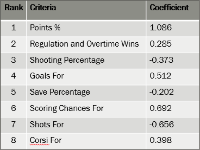
Starting off with all statistics I could collect for teams at Thanksgiving, I began to weed out less predictive variables until I landed on a group of 8. Using Recursive Feature Elimination (RFE), I was able to continually run the model and see which variables were deemed most predictive and should be included in the model. The factors as listed below were deemed most predictive, in order of importance
to the model.
While point percentage is the most predictive, other statistics like shooting percentage, save percentage, or goals for percentage provide a bigger picture perspective that allows for a better predictive capability for the machine learning model.
It has been determined that having higher shots for, shooting percentage, and save percentage all have a negative effect on whether or not you end up making the playoffs. For shooting percentage and save percentage, this is likely due to the fact that the model has identified a PDO like correlation in which teams with a lower save percentage and shooting percentage can be classified as “unlucky” and will eventually regress towards the norm. Additionally, the number of shots a team takes relative to the other team has a negative correlation with making the playoffs. This could be due to score effects that cause losing teams to typically generate more shots that are of lower quality. As the model shows, it is primarily high danger chances that are predictive of making the playoffs, not just any shot.
The Results

Running the model, 81.25% or 13 out of 16 playoff teams in a playoff spot as of March 1stwere correctly classified as playoff teams. Furthermore, an additional 2 teams (Columbus and Colorado) sat only 1 point back of a playoff spot. In contrast, picking the playoff teams at Thanksgiving would only result in a 68.75% success rate or 11 out of 16 teams. Furthermore, 3 teams that were in a playoff position at Thanksgiving are no longer in the playoff race in comparison to only 1 team (Buffalo) predicted by the model.
Outliers
Particularly interesting decisions made by the machine learning model include the decision to not pick the Rangers to make the playoffs, despite leading the Metro at Thanksgiving, and the choice to select Vegas to make the playoffs despite a slow start.
One reason behind this choice could have been New York’s low number of ROW. With a mere 8 ROW in 22 games, the New York Rangers sat atop the Metropolitan Division mainly in part to their 4-0 record in shootouts. Seeing that the New York Rangers were playing so many close games, the model likely discounted the strength of the Rangers. Additionally, the New York Rangers had the 4thlowest corsi for %, 6thlowest shots for %, 9thlowest scoring chance for %. As for points for %, the Rangers were ranked at an underwhelming 13th in the league, but led the Metro since the Metro was a weak division and the Rangers had more games played. Given the Rangers low valuation across all these supporting criteria, the machine predicted that they would not make the playoffs despite their stronger points for % at Thanksgiving.
As for the Golden Knights, despite holding the 29thbest point % in the league, Vegas was among the top 4 in the league in shots for %, corsi for % and scoring chances for %. Additionally, Vegas had the league’s lowest PDO (SH% + SV%) at 95.66. Given all these things considered, the model likely believed it was only a matter of time before the Vegas Golden Knights began winning.
Flaws in the Model
While my machine learning model appears to have the ability to out predict the strategy of picking all playoff teams at Thanksgiving, two main limitations of the model as highlighted above is the inability of the machine to pick teams based on the given playoff format, and the lack of data at various game states.
Unaware of the NHL’s current playoff format, the model picked 9 Eastern Conference teams, and only 7 Western Conference teams. Without a grasp on the alignment of divisions within the league, the model is at a disadvantage when picking teams, particularly when specific divisions or conferences are more “stacked” than others. Therefore, there is the potential of the model picking an otherwise impossible selection of teams to make the playoffs.
Furthermore, data collected to be fed into the model was only even-strength data. While this provides a decent picture of a team’s capability, certain teams that rely on their power play, as the Penguins traditionally have, may be disadvantaged and discounted. Finding a way to incorporate this data into the model would likely provide a fuller picture and a more accurate prediction.
Final Thoughts
While the model I have created is by no means perfect, it provides a unique perspective into not only the importance of the first 20 or so games of the season, but also what statistics beyond wins are important in attempting to classify a playoff team. While the model appears to out predict the strategy of selecting all playoff teams at Thanksgiving, it will be interesting to see in years to come if there is a continued ability to classify playoff teams given Thanksgiving stats.
Statistics retrieved from Natural StatTrick
Keep up to date with the Queen's Sports Analytics Organization. Like us on Facebook. Follow us on Twitter. For any questions or if you want to get in contact with us, email qsao@clubs.queensu.ca, or send us a message on Facebook.
How important is winning a period in the NHL? /
Sometimes when I watch hockey on television, the broadcast will display a stat that makes me cringe. One of my (least) favourites is a stat like the one displayed just under the score in the screenshot below:

Most of us have noticed these stats on broadcasts before. I imagine they are common because they match the game state (i.e. the Leafs are leading after the first period), so broadcasters probably believe we find them insightful. However, we are all smart enough to understand that teams should theoretically have a better record in games that saw them outscore their opponents in the first period. In this case, whatever amount of insight the broadcasters believe they are providing us with is merely an illusion. Perhaps they also saw value in the fact that the Leafs were undefeated in those 13 games, but that is not what I want to focus on today.
More generally, my primary objective for this post is to shed light on the context behind this type of stat, mostly because broadcasts rarely provide it for us. Ultimately, I will examine 11 seasons worth of data to understand how the outcome of a specific period effects the number of standings points a team should expect to earn in that game. Yes, this means there will be binning*. And yes, I acknowledge that binning is almost always an inappropriate approach in any meaningful statistical analysis. The catch here is that broadcasters continue to display these binned stats without any context, and I believe it is important to understand the context of a stat we see on television many times each season.
* Binning is essentially dividing a continuous variable into subgroups of arbitrary size called “bins.”In this case, we are dividing a 60-minute hockey game into three 20-minute periods.
A particular team wins a period by scoring more goals than their opponent. I looked at which teams won, lost, or tied each period by running some Python code through a data set provided by moneypuck.com. The data includes 13057 regular season games between the 2007-2008 and 2017-2018 seasons, inclusive. (Full disclosure: I’m pretty sure four games are missing here. My attempts to figure out why were unsuccessful, but I went ahead with this article because the rest of my code is correct, and 4 games out of over 13K is virtually insignificant anyways). The table below displays our sample sizes over those eleven seasons:

Remember that when the home team loses, the away team wins, so the table with our results will be twice as large at the table above. I split the data into home and away teams because of home-ice advantage; Home teams win more games than the visitors, which suggests that home teams win specific periods more often too. We can see this is true in the table shown above. In period 1, for example, the home team won 4585 times and lost only 3822 times. The remaining 4650 games saw first periods that ended in ties.
We want to know the average number of standings points the home team earned in games after winning, tying, or losing period 1. This will give us three values: One average for each outcome of the first period. We also want to find the same information for the away team, giving us atotal of six different values for period 1. (This step is not redundant because of the “Pity Point”system, which awards one point to the losing team if they lost in overtime or the shootout. The implication is that some games result in two standings points but others end in three, so knowing which team won the game still does not tell us exactly how many points the losing team earned). Repeating this process for periods 2 and 3 brings our total to 18 different values. The results are shown below:

The first entry in the table (i.e. the top left cell) tells us that when home teams win period 1, they end up earning an average of 1.65 points in the standings. We saw earlier that the home team has won the first period 4585 times, and now we know that they typically earn 1.65 points in the standings from those specific games. But if we ignore the outcome of each period, and focus instead on the outcomes of all 13057 games in our sample, we find that the average team earns 1.21 points in the standings when playing at home. (This number is from the sentence below the table —the two values there suggest the average NHL team finishes an 82-game season with around 91.43 points, which makes sense). So, we know that home teams win an average of 1.21 points in general, but if they win the first period they typically earn 1.65 points. In other words, they jumped from an expected points percentage of 60.5% to 82.5%. That is a significant increase.
However, in those 4585 games, the away team lost the first period because they were outscored by the home team. It is safe to say that the away team experienced a similar change, but in the opposite direction. Indeed, their expected gain decreased from 1.02 points (a general away game) to 0.54 points (the condition of losing period 1 on the road). Every time your favourite team is playing a road game and loses period 1, they are on track to earn 0.48 less standings points than when the game started; That is equivalent to dropping from a points percentage of 51% to 27%. Losing period 1 on the road is quite damaging, indeed.
Another point of interest in these results, albeit an unsurprising one, is the presence of home-ice advantage in all scenarios. Regardless of how a specific period unfolds, the home team is always better off than the away team would be in the same situation.
I also illustrated these results in Tableau for those of you who are visual learners. The data is exactly the same as in the results table, but now it’s illustrated relative to the appropriate benchmark (1.21 points for home teams and 1.02 points for away teams).

Now, let’s reconsider the original stat for a moment. We know that when the Leafs won the first period, they won all 13 of those games. Clearly, they earned 26 points in the standings from those games alone. How many points would the average team have earned under the same conditions? While the broadcast did not specify which games were home or away, let’s assume just for fun that 7 of them were at home, and 6 were on the road. So, if the average team won 7 home games and 6 away games, and also happened to win the first period every time, they would have: 7(1.65) + 6(1.53) = 20.73 standings points. Considering that the Leafs earned 26, we can see they are about 5 points ahead of the average team in this regard. Alternatively, we can be nice and allow our theoretical “average team”to have home-ice advantage in all 13 games. This would bump them up to 13(1.65) = 21.45 points, which is still a fair amount below the Leafs’ 26 points.
One issue with this approach is that weighted averages like the ones I found do not effectively illustrate the distributionof possible outcomes. All of us know it is impossible to earn precisely 1.65 points in the standings —the outcome is either 0, 1, or 2. An alternative approach involves measuring the likelihood of a team coming away with 2 points, 13 times in a row, given that all 13 games were played at home and that they won the first period every time. We know the average is 13(1.65) = 21.45 standings points, but how likely is that? It took a little extra work, but I calculated that the average team would have only a 3.86% chance to earn all 26 points available in those games. (I did this by finding the conditional probability of winning a specific game after winning the first period at home, and then multiplying that number by itself 13 times). Although the probability for the Leafs is a touch lower than this, since there is a good chance a bunch of those 13 games were not played at home, you should not allow such a low probability to shock you; 13 games is a small sample, especially for measuring goals. There is definitely lots of luck mixed in there.
This brings us back to my original anecdote about cringing whenever I encounter this type of stat. Even if we acknowledge its fundamental flaw —scoring goals leads to wins, no matter when those goals occur in a game —the stat is virtually meaningless in a small sample. Goals are simply too rare to provide us with much insight in a sample of 13 games. Nevertheless, broadcasters will continue displaying these numbers without context. This article will not change that. So, the next time it happens, you can now compare that team to league average over the past eleven seasons. Even if the stat is not shown on television, all you need to know is the outcome of a specific period to find out how the average team has historically performed under the same condition. At the very least, we have a piece of context that we did not have before.
Do tired defensemen surrender more rebounds? /

Two thoughts popped into my mind, one after the other.
First, I wondered whether an NHL player’s performance fluctuated depending on how long they had been on the ice. Does short-term fatigue play a significant role over a single shift?
Second, I wondered how to quantify (and hopefully answer) this question.
The Data
Enter the wonderfully detailed shot dataset recently published by moneypuck.com. In it, we have over 100 features that describe the location and context of every shot attempt since the 2010-11 NHL season. You can find the dataset here: http://moneypuck.com/about.htm#data.
Within this data I found two variables to test my idea. First, the average number of seconds that the defending team’s defensemen had been on the ice when the attacking team’s shot was taken. The average across all 471,898 shots was 34.2 seconds, if you’re curious. With this metric I had a way to quantify the lifespan of a shift, but what variable could be used as a proxy for performance?
Fortunately, the dataset also says whether each shot was a rebound shot. To assess defensive performance, I decided to use the rate at which shots against were rebounds. Recovering loose pucks in your own end is a fundamental part of the job description for NHL defensemen, especially in response to your goalie making a save. Should the defending team fail to recover the puck, the attacking team could generate a rebound shot, which would often result in a goal against. We can see evidence of this in the 5v5 data:

Rebound shooting % is 3.6x larger than non-rebound shooting %
The takeaway here is that 24.1% of rebound shots go into the net, compared to just 6.7% of non-rebound shots. Rebounds are much closer to the net on average, which can explain much of this difference.
I believe that a player’s ability to recover loose pucks is a function of their ability to anticipate where the puck is going to be and their quickness to get to there first. While anticipation is a mental talent, quickness is physical, meaning that a defender’s quickness could deteriorate over the course of their shift as short-term fatigue sets in. Could their ability to prevent rebound shots be consequently affected? Let’s plot that relationship:

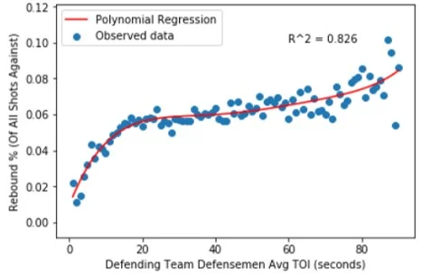
There’s a lot going on here, so let’s break it down.
The horizontal axis shows the average shift length of the defending defense pairing at the time of the shot against. I cut the range off at 90 seconds because data became scarce after that; pairings normally don’t get stuck on the ice for more than a minute and a half at 5v5. The vertical axis shows what percentage of all shots against were rebounds.
Each blue dot represents the rebound rate for all shots that share a shift length, meaning that there are 90 data points, or one for each second. The number of total shots ranges from 382 (90 seconds) to 8,124 (27 seconds). Here’s the full distribution:

We can see that sample size is an inherent limitation for long shifts. The number of shots against drops under 1,000 for all shift lengths above 74 seconds, which means that the conclusions drawn from this portion of the data need to be taken with a grain of salt. This sample size issue also explains the plot’s seemingly erratic behaviour towards the upper end of the shift length range, as percentage rates of relatively rare events (rebounds) tend to fluctuate heavily in smaller sample sizes.
The Model
Next, I wanted to create a model to represent the trend of the observed data. The earlier scatter plot tells us that the relationship between shift length and rebound rate is probably non-linear, so I decided to use a polynomial function to model the data. But what should be this function’s degree? I capped the range of possibilities at degree = 5 to avoid over-fitting the data, and then set out to systematically identify the best model.
It’s common practice to split data into a training set and a testing set. I subjectively chose a split of 70-30% for training and testing, respectively. This means that the model was trained using 70% of all data points, and then its ability to predict previously unseen data was measured using the remaining 30%. Model accuracy can be measured by any number of metrics, but I decided to use the root mean squared error (RMSE) between the true data points and the model’s predictions. RMSE, which penalizes large model errors, is among the most popular and commonly-used error functions. I conducted the 70-30 splitting process 10,000 times, each time training and testing five different models (one each of degree 1, 2, 3, 4, and 5). Of the five model types, the 5th degree function produced the lowest root mean squared error (and therefore the highest accuracy) more often than the degree 1, 2, 3 or 4 functions. This tells us that the data is best modelled by a 5th degree polynomial. Fitting a normalized 5th degree function produced the following equation:

x = shift length in seconds
This equation is less interesting than the curve that it represents, so let’s look at that:
What Does It Mean?
The regression appears to generally do a good job of fitting the data. Our r-squared value of 0.826 tells us that ~83% of the variance in ‘Rebound %’ is explained by defensemen shift length, which is encouraging. Let’s talk more about the function’s shape.

Rebound rate first differences decrease at first as the rate stabilizes, and then increase further
As defense pairings spend more time on the ice, they tend to surrender more rebound shots, meaning that they recover fewer defensive zone loose pucks. Pairings who are early in their shift (< 20 seconds) surrendered relatively few rebound shots, but there's likely a separate explanation for this. It's common for defensemen to change when the puck is in other team’s end, meaning that their replacements often get to start shifts with the puck over 100 feet away from the net they're defending. For a rebound shot to be surrendered, the opposing team would need to recover possession, transition to offense, enter the zone and generate a shot. These events take time, which likely explains why rebound rates are so low in the first 15-20 seconds of a shift.
We can see that rebound rates begin to stabilize after this threshold. The rate is most flat at the 34 second mark (5.9%), after which the marginal rate increase begins to grow for each additional second of ice time. This pattern of increasing steepness can be seen in the ‘Rebound Rate Increase’ column of the above chart and likely reflects the compounding effects of short-term fatigue felt by defensemen late in their shifts, especially when these shifts are longer than average. The sample size concerns for long shifts should again be noted, as should the accompanying skepticism that our long-shift data accurately represent their underlying phenomenon.
The main strategic implications of these findings relate to optimal shift length. The results confirm the age-old coaching mantra of ‘keep the shifts short’, showing a positive correlation between shift length and rebound rates. Defensemen shift lengths should be kept to 34 seconds or less, ideally, since the data suggests that performance declines at an increasingly steep rate beyond this point. Further investigation is needed, however, before one can conclusively state that this is the optimal shift length.
Considering that allowing 4 rebound shots generally translates to a goal against, it’s strategically imperative to reduce rebound shot rates by recovering loose pucks in the defensive zone. Better-rested defensemen are better able to recover these pucks, as suggested by the strong, positive correlation between defensemen shift length and rebound rates. While further study is needed to establish causation, proactively managing defensive shift lengths appears to be a viable strategy to reduce rebound shot rates.
Any hockey fan could tell you that shifts should be kept short, but with the depth of available data we're increasingly able to figure out exactly how short they should be.
Cover photo credited to Sergei Belski — USA Today Sports
In search of similarity: Finding comparable NHL players /

The following is a detailed explanation of the work done to produce my public player comparison data visualization tool. If you wish to see the visualization in action it can be found at the following link, but I wholeheartedly encourage you to continue reading to understand exactly what you’re looking at:
https://public.tableau.com/profile/owen.kewell#!/vizhome/PlayerSimilarityTool/PlayerSimilarityTool
NHL players are in direct competition with hundreds of their peers. The game-after-game grind of professional hockey tests these individuals on their ability to both generate and suppress offense. As a player, it’s almost guaranteed that some of your competitors will be better than you on one or both sides of the puck. Similarly, you’re likely to be better than plenty of others. It’s also likely that there are a handful of players league-wide whose talent levels are right around your own.
The NHL is a big league. In the 2017-18 season, 759 different skaters suited up for at least 10 games, including 492 forwards and 267 defensemen. In such a deep league, each player should be statistically similar to at least a handful of their peers. But how to find these league-wide comparables?
Enter a bit of helpful data science. Thanks to something called Euclidean distance, we can systemically identify a player’s closest comparables around the league. Let’s start with a look at Anze Kopitar.

Anze Kopitar's closest offensive and defensive comparables around the league
The above graphic is a screenshot of my visualization tool.
With the single input of a player’s name, the tool displays the NHL players who represent the five closest offensive and defensive comparables. It also shows an estimate of the strength of this relationship in the form of a similarity percentage.
The visualization is intuitive to read. Kopitar’s closest offensive comparable is Voracek, followed by Backstrom, Kane, Granlund and Bailey. His closest defensive comparables are Couturier, Frolik, Backlund, Wheeler, and Jordan Staal. All relevant similarity percentages are included as well.
The skeptics among you might be asking where these results come from. Great question.
A Brief Word on Distance
The idea of distance, specifically Euclidean distance, is crucial to the analysis that I’ve done. Euclidean distance is a fancy name for the length of the straight line that connects two different points of data. You may not have known it, but it’s possible that you used Euclidean distance during high school math to find the distance between two points in (X,Y) cartesian space.
Now think of any two points existing in three-dimensional space. If we know the details of these points then we’re able to calculate the length of the theoretical line that would connect them, or their Euclidean distance. Essentially, we can measure how close the data points are to each other.
Thanks to the power of mathematics, we’re not constrained to using data points with three or fewer dimensions. Despite being unable to picture the higher dimensions, we've developed techniques for measuring distance even as we increase the complexity of the input data.
Applying Distance to Hockey
Hockey is excellent at producing complex data points. Each NHL game produces an abundance of data for all players involved. This data can, in turn, be used to construct a robust statistical profile for each player.
As you might have guessed, we can calculate the distance between any two of these players. A relatively short distance between a pair would tell us that the players are similar, while a relatively long distance would indicate that they are not similar at all. We can use these distance measures to identify meaningful player comparables, thereby answering our original question.
I set out to do this for the NHL in its current state.
Data
First, I had to determine which player statistics to include in my analysis. Fortunately, the excellent Rob Vollman publishes a data set on his website that features hundreds of statistics combed from multiple sources, including Corsica Hockey (http://corsica.hockey/), Natural Stat Trick (https://naturalstattrick.com) and NHL.com. The downloadable data set can be found here: http://www.hockeyabstract.com/testimonials. From this set, I identified the statistics that I considered to be most important in measuring a player’s offensive and defensive impacts. Let’s talk about offense first.

List of offensive similarity input statistics
I decided to base offensive similarity on the above 27 statistics. I’ve grouped them into five categories for illustrative purposes. The profile includes 15 even-strength stats, 7 power-play stats, and 3 short-handed stats, plus 2 qualifiers. This 15-7-3 distribution across game states reflects my view of the relative importance of each state in assessing offensive competence. Thanks to the scope of these statistical measures, we can construct a sophisticated profile for each player detailing exactly how they produce offense. I consider this offensive sophistication to be a strength of the model.
While most of the above statistics should be self-explanatory, some clarification is needed for others. ‘Pass’ is an estimate of a player’s passes that lead to a teammate’s shot attempt. ‘IPP%’ is short for ‘Individual Points Percentage’, which refers to the proportion of a team’s goals scored with a player on the ice where that player registers a point. Most stats are expressed as /60 rates to provide more meaningful comparisons.
You might have noticed that I double-counted production at even-strength by including both raw scoring counts and their /60 equivalent. This was done intentionally to give more weight to offensive production, as I believe these metrics to be more important than most, if not all, of the other statistics that I included. I wanted my model to reflect this belief. Double-counting provides a practical way to accomplish this without skewing the model’s results too heavily, as production statistics still represent less than 40% of the model’s input data.
Now, let's look at defense.

List of defensive similarity input statistics
Defensive statistical profiles were built using the above 19 statistics. This includes 15 even-strength stats, 2 short-handed stats, and the same 2 qualifiers. Once again, even-strength defensive results are given greater weight than their special teams equivalents.
Sadly, hockey remains limited in its ability to produce statistical measurements of individual defensive talent. It’s hard to quantify events that don’t happen, and even harder to properly identify the individuals responsible for the lack of these events. Despite this, we still have access to a number of useful statistics. We can measure the rates at which opposing players record offensive events, such as shot attempts and scoring chances. We can also examine expected goals against, which gives us a sense of a player’s ability to suppress quality scoring chances. Additionally, we can measure the rates at which a player records defense-focused micro-events like shot blocks and giveaways. The defensive profile built by combining these stats is less sophisticated than its offensive counterpart due to the limited scope of its components, but the profile remains at least somewhat useful for comparison purposes.
Methodology
For every NHLer to play 10 or more games in 2017-18, I took a weighted average of their statistics across the past two seasons. I decided to weight the 2017-18 season at 60% and the 2016-17 season at 40%. If the player did not play in 2016-17, then their 2017-18 statistics were given a weight of 100%. These weights represent a subjective choice made to increase the relative importance of the data set’s more recent season.
Having taken this weighted average, I constructed two data sets; one for offense and the other for defense. I imported these spreadsheets into Pandas, which is a Python package designed to perform data science tasks. I then faced a dilemma. Distance is a raw quantitative measure and is therefore sensitive to its data’s magnitude. For example, the number of ‘Games Played’ ranges from 10-82, but Individual Points Percentage (IPP%) maxes out at 1. This magnitude issue would skew distance calculations unless properly accounted for.
To solve this problem, I proportionally scaled all data to range from 0 to 1. 0 would be given to the player who achieved the stat’s lowest rate league-wide, and 1 to the player who achieved the highest. A player whose stat was exactly halfway between the two extremes would be given 0.5, and so on. This exercise in standardization resulted in the model giving equal consideration to each of its input statistics, which was the desired outcome.
I then wrote and executed code that calculated the distance between a given player and all others around the league who share their position. This distance list was then sorted to identify the other players who were closest, and therefore most comparable, to the original input player. This was done for both offensive and defensive similarity, and then repeated for all NHL players.
This process generated a list of offensive and defensive comparables for every player in the league. I consider these lists to be the true value, and certainly the main attraction, of my visualization tool.
Not satisfied with simply displaying the list of comparable players, I wanted to contextualize the distance calculations by transforming them into a measure that was more intuitively meaningful and easier to communicate. To do this, I created a similarity percent measure with a simple formula.

In the above formula, A is the input player, B is their comparable that we’re examining, and C is the player least similar to A league-wide. For example, if A->B were to have a distance of 1 and A->C a distance of 5, then the A->B similarity would be 1 - (1/5), or 80%. Similarity percentages in the final visualization were calculated using this methodology and provide an estimate of the degree to which two players are comparable.
Limitations
While I wholeheartedly believe that this tool is useful, it is far from perfect. Due to a lack of statistics that measure individual defensive events, the accuracy of defensive comparisons remains the largest limitation. I hope that the arrival of tracking data facilitates our ability to measure pass interceptions, gap control, lane coverage, forced errors, and other individual defensive micro-events. Until we have this data, however, we must rely on rates that track on-ice suppression of the opposing team’s offense. On-ice statistics tend to be similar for players who play together often, which causes the model to overstate defensive similarity between common linemates. For example, Josh Bailey rates as John Tavares’ closest defensive comparable, which doesn’t really pass the sniff test. For this reason, I believe that the offensive comparisons are more relevant and meaningful than their defensive counterparts.
Use Scenarios
This tool’s primary use is to provide a league-wide talent barometer. Personally, I enjoy using the visualization tool to assess relative value of players involved in trades and contract signings around the league. Lists of comparable players give us a common frame through which we can inform our understanding of an individual's hockey abilities. Plus, they’re fun. Everyone loves comparables.
The results are not meant to advise, but rather to entertain. The visualization represents little more than a point-in-time snapshot of a player’s standing around the league. As soon as the 2018-19 season begins, the tool will lose relevance until I re-run the model with data from the new season. Additionally, I should explicitly mention that the tool does not have any known predictive properties.
If you have any questions or comments about this or any of my other work, please feel free to reach out to me. Twitter (@owenkewell) will be my primary platform for releasing all future analytics and visualization work, and so I encourage you to stay up to date with me through this medium.
Cover photo credited to Jae C. Hong — Associated Press
How the Queen's Men's Hockey Team is using analytics - Interviewing Director of Analytics, Miles Hoaken /
By Anthony Turgelis (@AnthonyTurgelis)
If you've ever thought that sports analytics could only be implemented in national leagues, where there is plenty of data made publicly, then it's time to think again. Miles Hoaken is a first year Queen's University student in the Commerce program, that is the creator and director of the analytics department for the Queen's Men's Hockey team. In Miles' first year alongside the coaching staff, the team was able to break the school's record of most wins in a season (19) and finish second in the OUA Eastern conference. I sat down with Miles to talk about how he uses analytics to help make the team even better, and for tips on how other students can start getting into hockey analytics.
Thanks for coming today and agreeing to do this interview. I’m sure many students who support the Queen’s Men’s Hockey Team aren’t aware that there is an analytics department for the team, let alone that it’s run by a Queen’s student. Tell us a bit about who you are and what you do.
My name’s Miles Hoaken and I’m from Toronto. I started getting into hockey analytics when I was 13 years old. Basically, the Leafs lost game 7, blowing a 4-1 lead (as I’m sure a lot of you are aware), which made me realize that there might be another layer that myself and Leafs management weren’t paying attention to, and since they’re my childhood team I tend to follow them more. I started a blog when I was 13 years old, writing down some ideas that I had that were based on some hockey analytics, but not a lot since I was only 13 and I didn’t have the math background at the time to understand what some of the stats were. In 2014, the summer of analytics, I saw tons of people getting hired and realized it was realistic for analysts to get hired based on the work they produced on their blogs or Twitter, so I decided to get further into analytics, started writing more on my blog, and then in Grade 12 I got an analytics position with my high school team. I did statistical consulting on their play, mainly analyzing zone entries but varied depending on what the coach wanted from me on that day. From there, I parlayed that into my role with Queen’s, which is essentially running all their analytics and statistical operations. I basically serve as a coach on their coaching staff, so I’m right there in the office helping make decisions, advising the coach on certain strategy items, giving presentations to the players on occasion, and running that whole operation. We take a variety of stats, mainly pertaining to offensive output since that was the area coach was most interested in.
So you’re 18 years old and working with the coaches for the Varsity Hockey Team here at Queen’s for players who are often 3-5 years older than you. Cool to think about. How do you get the data that you use?
I get all the data live at the games, and it’s all tracked by hand. I print-out templates before the game that have everything that I’m going to fill out, for example, for an entry chart I’ll have categories to see who entered the zone, what type of entry it was (controlled or uncontrolled), what general location it was, and then some counting stats. To get the shot locations, I simply mark them down on a piece of paper and fill in the numbers in my spreadsheet after the game. This works well for us since we are trying to do them all live. I unfortunately don’t have the time luxury to go through all the games for many different stats and many different viewings, because I would probably fail all my school courses if I did. So it has to all be live, and has to all be fast, so the best way to do that right now is by hand. Next year, we have five other people helping me track stats, which should allow us to have more data to work with, but the long-term goal is to automate these parts of the job so that when I graduate, the analytics department could be run by one person at the click of a button.
Are you looking for more students to help out?
Right now we’ve filled all of our data-tracker positions for the upcoming year. We’re always looking for coders who can help out on some of the stuff on the presentation side since building a portal for the coaches is something that I’m trying to do. At my current level of coding I don’t think I could do it, but eventually with some help I think that we can get there. Keep watching our Facebook page, after next-year we’ll be looking for more data-trackers.
How has the coaching staff responded to your work with them?
The whole staff has been very receptive to analytics. Sometimes I come in with crazy ideas, but they really bear with me and take into account what I’m saying. Credit goes to Brett Gibson, when I walked into his office in the first meeting, I was a bit of an unknown and we were going to use an iPad app to track stats. I was able to convince him that the iPad app wasn’t that good and would be a waste of his money and the program’s money and that they should instead trust me and my templates. Maybe it takes a little bit of logic and a bit of crazy to trust an 18 year-old that he had never met before, but he put his faith in me and gave me this role and I will forever be grateful to him for that. He’s done a great job of incorporating me into the decisions and making sure my voice is heard. It’s something he didn’t have to do but I’m really glad he did. It’s been a great situation with the coaches, and coach Gibson has brought the program from a point where we only had 4 former CHLers when he started, to 21 CHLers now so that speaks to his work ethic and commitment to the program for sure.
What’s your relationship like with the players? Do you think they’ve bought in to your recommendations?
I’ve presented to them once so far. It was interesting to read the room because it seemed like the people at the top of the list for the stats I was presenting had a quicker buy-in to what I was talking about. The players at the bottom of the list seemed to look a little bit more confused by it, but what I found that the players near the bottom of the list actually had a larger increase in these stats than those near the top of the list, which made me think they were responding well to it. They also get access to my reports after every game.
Do you do any coding as part of what you do?
I would say that half of my job is in the rink doing the tracking and recommendations, and the other half is during the week, coding and making programs. The report I give to the coach after every game contains some offensive statistics which are all generated by graphs on the program R. I set it up so that I can simply change the game number and it will generate the code for that game. It’s a big part of what I do, if anyone is looking to get into hockey analytics, I would say the first thing to learn is coding because it will just make everything a lot easier. I also use coding to generate statistics on the league. I have a web scraper that takes the raw data from the U-Sports website and then turns it into ‘fancy stats’ – Goals for %, Shots for %, some I’m even able to get for 5v5 play through the data that they give us. So coding is a big part of it, I use R, personally but there is a big debate in the hockey analytics community between R and Python – you really can’t go wrong with either. I’m learning Python as part of a coding course at Queen’s next year (CISC121), but R is what I started with and the one I feel the most comfortable with.
This year you spoke about what you do for the Queen's Men's Hockey Team at VANHAC (Vancouver Hockey Analytics Conference). The presentation link is here. Tell us about your experience at VANHAC. Would you recommend it for those who are interested in working or learning about hockey analytics?
VANHAC was a really great experience for me. I went as a high school student, it was sort of like my grad trip. Some people go on S-Trip, I went to a hockey analytics conference which I think tells you all you need to know about my personality and my passion for this. *laughs* VANHAC is really awesome, it’s probably the best conference in North America, in terms of your value and hockey analytics specifically. Sloan (MIT) is the big one for sports analytics in general which I hope to go to someday. Really though, if you want to meet people from NHL teams, see some of the best research that’s come out recently, you have to go to VANHAC. It’s great because you don’t necessarily need to be an expert to go, some people were there with no experience whatsoever, didn’t know what Corsi was and ended up really enjoying it so it’s a really fun environment. The hockey analytics community is one of the most welcoming communities ever. When I was presenting there this year I didn’t feel nervous at all, so I definitely recommend it to any hockey analytics fan or even someone just trying to get into it.
Do you think we’ll ever see analytics at the forefront of U-Sports hockey? I feel like if more students knew that what you do is possible, there might be more focus towards it leading to each team having their own student-led analytics department.
At VANHAC, Brad Mills (@MillsBradley11) who’s the COO of Hockey Data (@HockeyDataInc), he approached me after my presentation and since he played in the NHL, we started talking about how the game is changing from the advances of analytics since he played. He said that given the amount of teams in U-Sports, and given all the statistics I was using, it would cost ~$11,000 to do what I do for every single team in the regular season. I was surprised at how little it was, but at the same time, I mentioned “That $11,000 is only worth it if we have all the data and nobody else does” since that’s what gives us our competitive advantage. That was actually one of the questions I received after my presentations which was “Do you do any analysis on players from other teams” and the answer to that is no, because the public information I can get is points, and I have no idea where these points are coming from necessarily, or if their skilled in any other way that a micro-stat could capture but I don’t have access to it. There are definitely people like me at other Universities, maybe not to the same extent or scale since we’re becoming one of the more advanced ones, especially given the amount of trackers we’ll have next year. I know Western and UOttawa have an analytics person as well but some teams don’t even have that voice in the room, and with that sometimes you can get into groupthink.
You’re active on Twitter (@SmoakinHoaken). How has Twitter been a learning tool for you?
Twitter has been huge for me, I got Twitter when I was 13, which you can probably tell from my handle (@SmoakinHoaken) (Hannah Montana reference). It’s been really key, people post their research on Twitter first, and people have gotten hired not because of Twitter, but because of the work they’ve put out on Twitter. It’s great for questions too, if you’re new to hockey analytics, you can use the hashtag #HockeyHelper and Alex Novet or someone from @HockeyGraphs will reply to you really fast with some advice.
Aside from @QSAOqueens, what are 5 Twitter accounts that you recommend hockey analytics enthusiasts to follow?
@IneffectiveMath – Micah Blake McCurdy (www.hockeyviz.com) – I got to meet him at VANHAC and he posts a lot of cool visuals and has a patreon with premium content which allows him to make even more graphs. His theme is that numbers are tired, and pictures are wired, which I really like. We’re actually trying to incorporate more pictures and visuals with Queen’s next year.
@AlexNovet and @HockeyGraphs, who post Hockey Graphs’ new articles on Twitter.
@SteveBurtch – I think he said he tweets a thousand times a month or something like that, so you get a lot of content that’s interesting. As he’s joked about himself, he has a surprisingly low “Bad-takes/60 tweets”, so you should definitely follow him.
@nnstats - Superbowl champion, someone I really look up to for advice on coding and life etc. She will be the first female GM for sure.
@MannyElk – If you’re looking for hockey twitter, but also salads and interesting takes on pop culture, you should definitely follow Manny.
Manny is certainly a fun follow, and the others are great as well. How would you recommend hockey enthusiasts to learn more about the analytics behind the game, aside from reading all of the great content on www.qsao-queens.com and attending QSAO events?
I’d say read a lot. That’s what I did throughout my highschool years, I would just read and read and read until I finally felt comfortable presenting these ideas to a coach to volunteer. If you’re not comfortable learning coding just yet, learn everything you can about Excel or other data visualization software. Also learn to effectively communicate your ideas. I know that if I present my idea to the coaching staff as a bunch of numbers, they will not care. If I explain how the idea could be implemented and show them that it works in some setting, then it’s way more likely to be accepted. I think that’s a big problem with some analysts, they can be a little cantankerous or have a high and mighty attitude at times where it’s ‘them-vs-the-world,’ but that mentality won’t serve them well in life. So it’s really important to communicate these ideas effectively, in my opinion.
All the VANHAC talks are on Youtube (link to the playlist here) so watching all of those would be great. If you’re still in high school, or even University, find a way to work with them in any capacity. I started by running a Twitter account in Grade 11 for the Don Mills Flyers. From there, I met plenty of interesting people in the industry that I still keep in contact with. This gig helped me work for my high school team, which ended up being analytics.
Thanks for doing this Miles, looking forward to working with you in the future to help make the Queen's Men's Hockey Team even better.
Keep up to date with the Queen's Sports Analytics Organization. Like us on Facebook. Follow us on Twitter. For any questions or if you want to get in contact with us, email qsao@clubs.queensuca, or send us a message on Facebook.